Image Carousel is an addon for the free MaxGalleria plugin that lets you display your galleries as carousels that visitors can click to rotate.
While the terms “slider” and “carousel” are often used interchangeably, the two are actually different, though similar, effects.
Whereas a slider actually “slides” the images vertically or horizontally with a momentum effect, a carousel rotates the image radially like an old carousel slider projector. If you’re interested in more of a true slider effect, including automatic movement, we have a separate Image Slider addon as well as a Slick Slider for WordPress addon.
In this article, though, we’ll focus exclusively on the Image Carousel addon for MaxGalleria.
We’ll show you how to use the plugin to create carousels from your MaxGalleria galleries. Then, we’ll dig into some additional tips and troubleshooting to help you use the addon.
How To Use The Image Carousel Addon For MaxGalleria
Because Image Carousel is an addon for the free MaxGalleria plugin, you’ll need both the Image Carousel addon and the free MaxGalleria plugin installed and activated.
Once both plugins are activated on your site, you’re ready to continue with the tutorial.
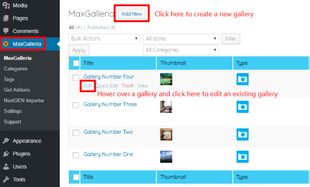
Step 1: Create New Gallery Or Choose Existing Gallery
The Image Carousel addon is a template that you can apply to the regular galleries that you create with the MaxGalleria plugin.
For that reason, to start using the plugin you need to either create a new gallery or edit one of your existing MaxGalleria galleries.
To perform both actions, click on the main MaxGalleria link in your WordPress dashboard and then select the appropriate action:
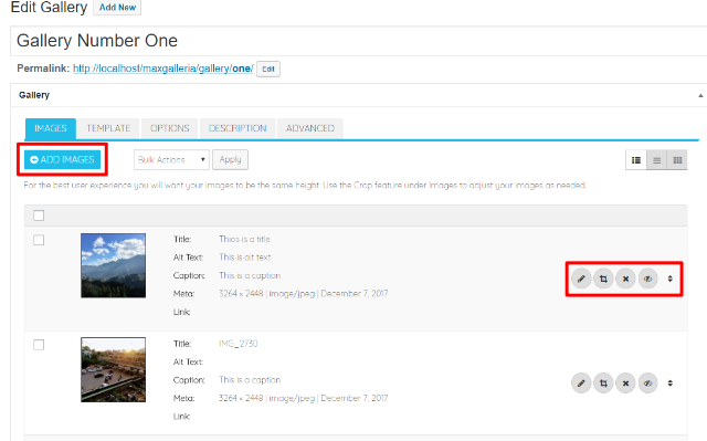
If needed, you can use the +ADD IMAGES buttons to add images to your new or existing gallery. And you can also further edit, crop, reorder, or remove images by using the various buttons next to each image:
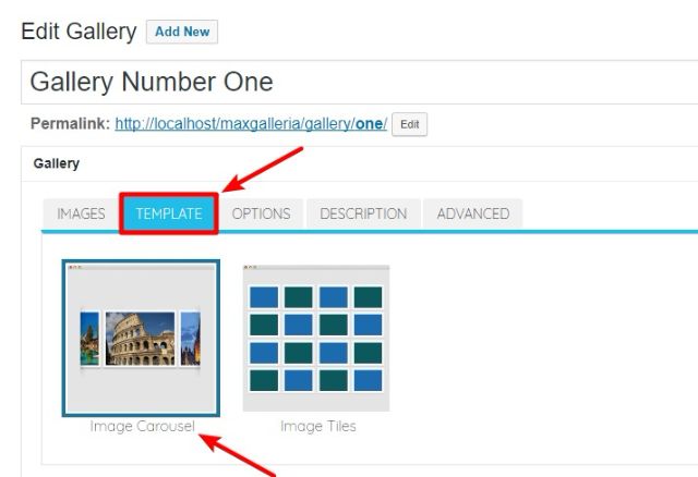
Step 2: Choose Image Carousel Template
Once you’ve added all the images to your gallery and arranged them in your desired order, go to the TEMPLATE tab and select the Image Carousel template:
Step 3: Configure Gallery Options
Once you’ve selected the Image Carousel template, move to the OPTIONS tab to configure how your image carousel should function.
Here are what the various options mean in this area:
GALLERY STYLES Section
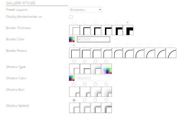
- Preset Layouts – lets you quickly choose from 6 different premade styles, rather than manually configuring the other individual settings in this section.
- Display Border – when checked, will display a border around your carousel. You can configure this border in the next options.
- Border Thickness – if enabled, how thick the border should be.
- Border Color – the color of the border.
- Border Radius – lets you choose between squared corners or various degrees of rounded corners.
- Shadow Type – lets you add an optional inner, outer, or color shadow.
- Shadow Color – if you selected color shadow in Shadow Type, this lets you choose the color.
- Shadow Blur – lets you choose the degree of blur to apply to the shadow.
- Shadow Spread – lets you choose the degree of spread to apply to the shadow.
Note – all the settings in this section apply to the carousel as a whole, rather than individual images. For example, if you choose to display two images at a time, the border will apply to the entire grouping, rather than to each image.
Here’s an example with a large border to illustrate this principle:

THUMBNAIL OPTIONS Section
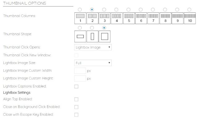
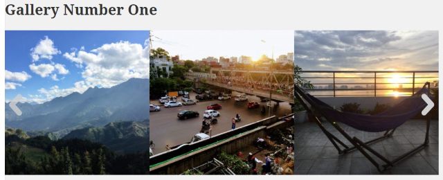
- Thumbnail Columns – lets you determine how many images to display at one time. For example, if you select 3 columns, your carousel will display 3 images at a time:
- Thumbnail Shape – lets you choose the orientation of the images in your carousel. Your options are landscape, portrait, or square.
- Thumbnail Click Opens – lets you choose what happens when a visitor clicks on an individual image. To open a lightbox, use the Lightbox Image option. You can also link to a custom link by choosing the Image Link option.
- Thumbnail Click New Window – if you selected an option other than Lightbox Image in the previous section, this lets you force the link to open in a new window when checked.
- Lightbox Image Size – lets you choose to display the lightbox image as full size or custom dimensions.
- Lightbox Image Custom Width and Height – if you select custom dimensions, you can choose those dimensions in these two settings.
- Lightbox Captions Enabled – when checked, your lightbox will display image captions below the image.
- Align Top Enabled – when checked, this will align the lightbox at the top of the page, rather than in the center of the page.
- Close on Background Click Enabled – when checked, lets visitors close the lightbox by clicking anywhere on the background.
- Close with Escape Key Enabled – when checked, lets visitors close the lightbox by hitting the escape key.
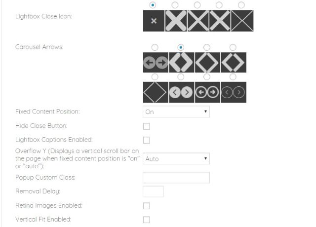
- Lightbox Close Icon – lets you choose the icon for the lightbox close button.
- Carousel Arrows – lets you choose the arrows that enable visitors to move between different carousel items.
- Fixed Content Position – you can turn on or off or leave as Auto.
- Hide Close Button – when checked, hides the close button on the lightbox.
- Overflow Y – when Fixed Content Position is On or Auto, this lets you display a vertical scroll bar on the page.
- Popup Custom Class – lets you add a custom CSS class to the lightbox popup for easy styling.
- Removal Delay – lets you set a delay, in milliseconds, for when a user closes the lightbox.
- Retina Images Enabled – in order for this setting to function, you need to upload a separate high-resolution image to your media library that ends in @2x. For example: “image.jpg” and “image@2x.jpg”.
- Vertical Fit Enabled – when checked, enables vertical fit.
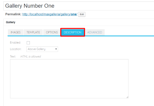
Step 4: Add Gallery Description (Optional)
Once you finish configuring the gallery options, you can move to the DESCRIPTION tab to add an optional description above or below your gallery:
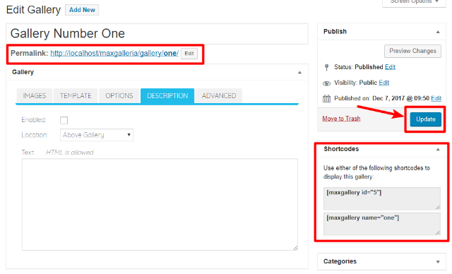
Step 5: Publish/Update And Insert Shortcode
Once you’re happy with your gallery, you can make it live by either hitting Publish (for new galleries) or Update (for existing galleries).
Then, you can access your gallery at its permanent URL or insert it anywhere in your site using the provided shortcode:
Common Tips And Troubleshooting For Image Carousels Addon
Below, we’ll go through some common issues and suggestions for using the Image Carousels Addon.
My Gallery Isn’t Moving Automatically. What’s Wrong?
The Image Carousel addon does not support automatic movement. Instead, visitors need to use the arrows that you set with the Carousel Arrows option to move between images.
If you want your images to move automatically, we recommend that you consider using one of our other two MaxGalleria addons:
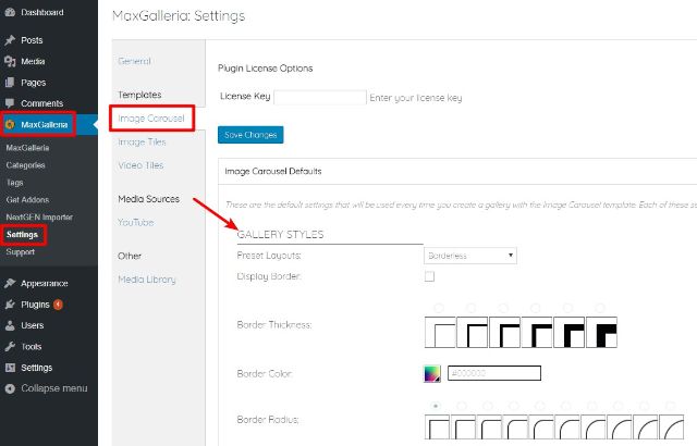
How To Set Default Settings For Image Carousels Addon
If you’re planning to create a number of different image carousels, you can save time by configuring default settings for the Image Carousel template.
While you can always modify these settings for individual galleries, the defaults will automatically apply to new Image Carousel templates unless manually changed.
To set the defaults:
- Go to MaxGalleria → Settings
- Choose the Image Carousel tab
- Configure the settings following the instructions above
We hope you found this guide useful. If you have any additional questions, please consult the Image Carousel support forum.