The Masonry addon for MaxGalleria helps you create Pinterest-style masonry layouts from any of your new or existing galleries created via the free MaxGalleria plugin.
In this article, we’ll show you how to use the Masonry addon for MaxGalleria, as well as some common tips and troubleshooting suggestions for the addon.
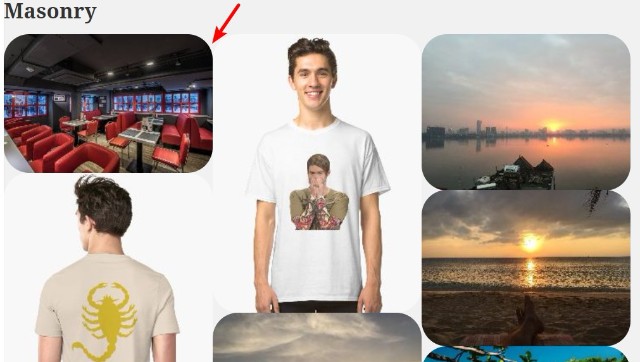
How To Create Pinterest-Style Masonry Galleries With MaxGalleria
The Masonry addon is an extension for the free core MaxGalleria plugin, so in order to continue
you’ll need both the Masonry addon and the core MaxGalleria plugin installed and activated.
Once you have both plugins installed and activated, you’re ready to begin the tutorial.
Step 1: Create New Gallery
Because the Masonry addon is a template that you apply to the regular galleries that you create with MaxGalleria, your first step is to either edit an existing gallery or create a new gallery that you want to use with the Masonry template.
For the best results, we recommend creating a new gallery, though. Here’s why:
In order to avoid cropping issues, we recommend that you resize your images to the same width (the heights can be different, of course, as that’s the defining feature of the masonry layout).
This step isn’t 100% necessary – but, like we said, it ensures that you don’t run into any cropping issues. Later on, we’ll show you how you can still link your resized masonry gallery images to a full resolution lightbox.
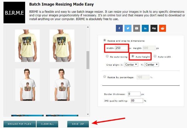
If you need help bulk resizing multiple images, the free Batch Image Resizing Made Easy tool makes it easy. Just enter your desired width in the Width box and make sure to choose the Auto-height option:
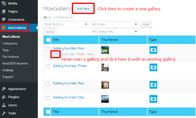
Then, to create a new gallery or edit an existing gallery, click on the MaxGalleria link in your WordPress dashboard and select the appropriate action:
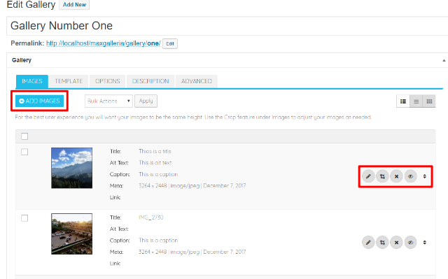
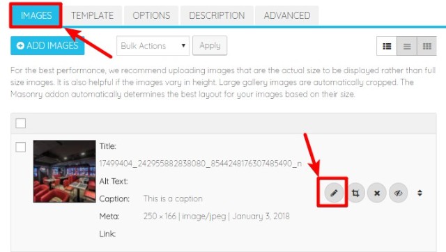
If needed, you can add images to your gallery by using the +ADD IMAGES button. You can also edit, crop, reorder, or remove images by using the various buttons next to each individual image:
Step 2: Choose Masonry Template
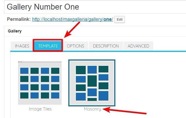
Once you’re happy with the images that you’ve chosen, click on the TEMPLATE tab and choose the Masonry option:
Step 3: Configure Gallery Options
Once you’ve selected the Masonry template, click on the OPTIONS tab to finish configuring your gallery.
You’ll see a number of options. Some options configure minor functionality, while others, like the Item width setting, are essential to configuring how your grid functions.
IMAGE OPTIONS Section
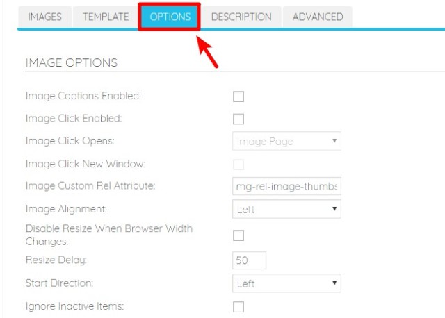
Here are what the various options mean:
- Image Captions Enabled – when checked, displays the image caption below the image.
- Image Click Enabled – when checked, makes it possible for visitors to click on individual images.
- Image Click Opens – when the previous setting is active, this lets you choose what happens when a visitor clicks on an image. This is where you add lightbox functionality, if desired.
- Image Click New Window – when checked, will force image link clicks to open in a new window.
- Image Custom Rel Attribute – by default, allows visitors to click prev/next when a lightbox is opened. You should leave this as the default unless you have a specific reason to change it.
- Image Alignment – lets you choose between left, center, and right.
- Disable Resize When Browser Width Changes – by default, the Masonry template will resize itself responsively if a visitor changes their browser width. By checking this box, you can disable that functionality.
- Resize Delay – assuming the previous option is not checked, this lets you specify how long, in milliseconds, the template should wait to resize the grid when a visitor’s browser size changes.
- Start Direction – lets you change how images are ordered in the grid. You can go left-to-right or right-to-left.
- Ignore Inactive Items – when checked, inactive items will be invisible.
Once you configure these options, the next option, Item width, is the most important setting to ensure that your grid looks and functions properly.
The Item width setting determines how many columns are in your masonry grid. Essentially, it sets the width of a single grid item.
If you don’t enter a value, your masonry grid will show as a single column, which negates the entire functionality of the masonry template!
To set your Item width, you can either:
- Enter a fixed width in pixels. We recommend that you use the same width that you resized your images to.
- Enter a percentage, by adding the % symbol after the value that you enter
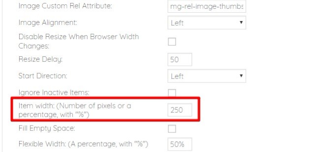
Note that, by default, there’s a small gap between images. So if you choose 25%, you’ll actually get a 3-column grid unless you remove the gap (which can be done via a setting on this page).
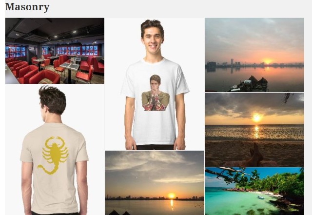
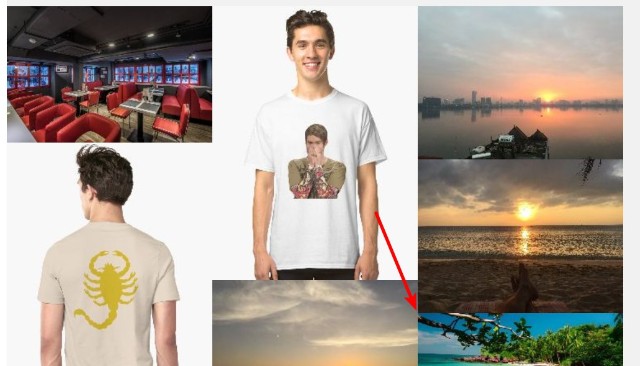
Here’s an example of how a masonry grid might look with the width set to 250 pixels (as per the example screenshot above):
Below the Item width setting, you can also configure additional settings:
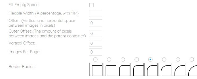
- Fill Empty Space – in case the columns end up uneven at the bottom, this setting adds boxes in the empty spaces at the bottom of the grid.
- Offset – the vertical and horizontal gap between images in pixels. When set to 0, the images will be connected like the image below:
- Outer Offset – the gap between images and the parent container.
- Vertical Offset – lets you further increase the vertical gap, in addition to the Offset option.
- Images Per Page – lets you manually limit the number of images on a single page and add pagination to view the rest of the images.
- Border Radius – lets you quickly add a radius to your images. For example, if you choose one of the curved presets, your masonry grid will look something like this:
LIGHTBOX SETTINGS Section
If you chose the Open Link in Lightbox option under Image Click Enabled/Image Click Opens in the previous section, this section lets you configure how the lightbox looks and functions.
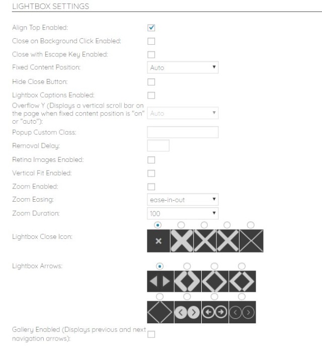
Here are what the various settings mean:
- Align Top Enabled – when checked, aligns the lightbox to the top of the page, rather than the default center alignment.
- Close on Background Click Enabled – when checked, visitors can close the lightbox by clicking anywhere on the background.
- Close with Escape Key Enabled– when checked, visitors can close the lightbox by hitting the escape key.
- Fixed Content Position – when off, visitors can scroll up or down.
- Hide Close Button – removes the close button that appears at the top of the lightbox by default.
- Lightbox Captions Enabled – displays an image’s caption below the lightbox.
- Overflow Y – when Fixed Content Position is Auto or On, this option displays a vertical scroll bar.
- Popup Custom Class – adds a custom CSS class to allow for easy custom styling.
- Removal Delay – how long, in milliseconds, to delay when closing the popup.
- Retina Images Enabled – enables retina images. In order for it to function, you need to also upload identical file names ending in “@2x” directly to the WordPress media library.
- Vertical Fit Enabled – when checked, will proportionally shrink the image based on the available height.
- Zoom Enabled – displays a zoom effect when opening or closing the lightbox.
- Zoom Easing – lets you choose the type of CSS3 easing.
- Zoom Duration – how long, in milliseconds, the zoom effect should take.
- Gallery Enabled – lets the visitor move between images in the lightbox by using previous or next arrows.
GALLERY OPTIONS Section
When the previous Gallery Enabled option is checked, you can configure additional settings in the GALLERY OPTIONS section:
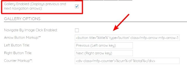
These options help you control the text and markup applied to the lightbox gallery.
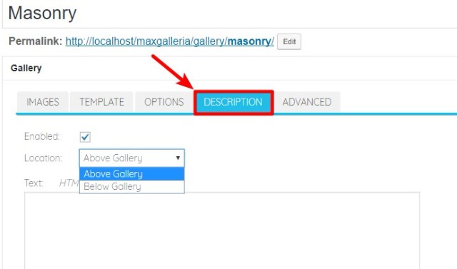
Step 4: Add Gallery Description (Optional)
Once you finish configuring the gallery options, you can move to the DESCRIPTION tab to add an optional description above or below your gallery:
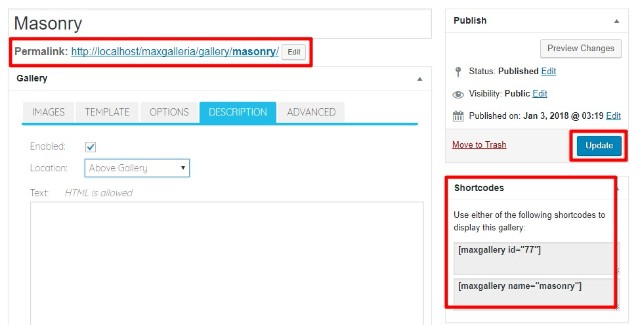
Step 5: Publish/Update And Insert Shortcode
Once you’ve finished configuring your masonry gallery, all you need to do is Publish it (for new galleries) or Update it (for existing galleries).
Once you do that, you can either access it at the permanent gallery URL or insert it anywhere else on your site using the provided shortcode:
Tips And Troubleshooting For MaxGalleria Masonry Addon
Below, we’ll go through some common tips and troubleshooting for using the Masonry addon for MaxGalleria.
How To Link Lightbox Gallery To Full-Size Image
As mentioned before, we recommend that you resize the images that you upload to the masonry template to the same width for the best results.
But if you’re using the lightbox functionality, you might want to still use the full resolution image in the lightbox (rather than the resized version).
To do that, you can upload the full resolution images to your WordPress media library. Then, you can link those full resolution images to your resized masonry gallery images. Here’s how:
- Go to the IMAGES tab
- Click the pencil icon next to each image
- Enter the link to the full resolution image in the Link box
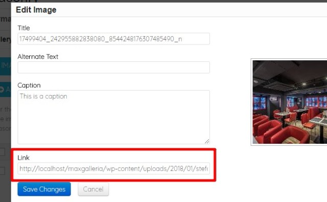
- Repeat the process for each image
Now, visitors will see the full-size image when they open the lightbox of your masonry gallery images.
Flash Of Unstyled Content When Loading Masonry Gallery
If you see a “Flash Of Unstyled Content” when you load your masonry gallery, the most likely cause is that you’re loading images that are larger than the width of your masonry gallery (which forces the images to be resized via JavaScript).
To fix this issue, we recommend resizing your images before adding them to the gallery, as explained at the beginning of this guide.
And that’s it – thanks for reading! If you have any further questions, please consult the MaxGalleria Masonry support forum.