Flickity, A Touch, Responsive Flickable Carousel, Now Part of MaxGalleria Pro 7.1.7
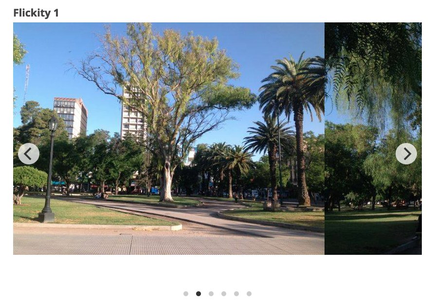
Flickity is a popular JavaScript library for creating touch-responsive carousels. Its ease of use, flexibility, and wide range of features make it an excellent choice for developers looking to implement carousels on their websites.
Key Features of Flickity
Touch, Mouse, and Keyboard Support:
- Flickity carousels are touch-friendly, making them ideal for mobile devices. Users can swipe through the slides using touch gestures.
- Mouse dragging is also supported, allowing users to interact with the carousel using a mouse.
- Keyboard navigation enables users to move between slides using arrow keys, enhancing accessibility.
Responsive Design:
Flickity is designed to be fully responsive, meaning it adjusts smoothly to different screen sizes and orientations. This makes it suitable for websites that need to function well on both desktop and mobile devices.
Cell Alignment and Sizing:
Developers can align carousel cells (slides) to the left, center, or right, and control the sizing of cells to fit various design requirements. The cells can be set to a uniform size or dynamically resized to fit the content.
Drag and Flick:
The library provides smooth dragging and flicking interactions, allowing users to easily navigate through slides. The friction and velocity settings can be customized to achieve the desired dragging behavior.
Free-Scrolling:
Free-scrolling mode lets users scroll through the carousel without snapping to individual slides. This can create a more fluid and continuous scrolling experience.
Wrap Around:
The wrap-around feature makes the carousel loop back to the beginning after reaching the end, providing an infinite scrolling effect.
Asynchronous Loading:
Flickity supports lazy loading of images, which helps improve page load times and performance by only loading images as they come into view.
Customizable UI Elements:
The library allows customization of various UI elements, such as prev/next buttons, page dots (indicators), and autoplay controls. Developers can style these elements or create custom ones.
Accessibility Features:
Flickity includes features to improve accessibility, such as ARIA attributes for screen readers and keyboard navigation support, ensuring that carousels are usable by people with disabilities.
JavaScript API and Events:
The extensive JavaScript API allows developers to control and interact with the carousel programmatically. Events such as select, settle, and dragStart provide hooks for custom functionality.
Advantages of Using Flickity
Ease of Use:
Flickity is easy to set up and use, even for developers with limited experience. The straightforward API and extensive documentation make it accessible for beginners while offering advanced features for experienced developers.
Performance:
Flickity is optimized for performance, ensuring smooth animations and quick load times. This is crucial for maintaining a good user experience, especially on mobile devices.
Flexibility:
The library’s flexibility allows it to be used in a wide range of scenarios, from simple image sliders to complex content carousels. Its customizable options mean it can be tailored to fit the specific needs of a project.
Compatibility:
Flickity works across all modern browsers and degrades gracefully in older ones. This ensures a consistent experience for all users, regardless of their browser choice.
Active Development and Community:
Flickity is actively maintained, with regular updates and improvements. It also has a strong community of users and contributors, providing support and sharing solutions to common problems.
Use Cases for Flickity
Image Galleries:
Flickity is often used for creating responsive image galleries where users can swipe through photos easily.
Product Carousels:
E-commerce websites use Flickity to showcase products in a carousel format, allowing users to browse through items without leaving the page.
Conclusion
Flickity is a robust and versatile JavaScript library for creating carousels. Its combination of user-friendly features, performance optimization, and extensive customization options make it an excellent choice for developers looking to enhance their websites with responsive, interactive carousels. Whether you’re building a simple image slider or a complex content carousel, Flickity provides the tools and flexibility to meet your needs.
To use our new Flickity template, update your current version of MaxGalleria Pro to version 7.1.7. Create a new gallery, choose the Flickity template and select options that you want to use.
Flickity Carousel Options
Click here to view details about Flickity Carousel options.
| Draggable Enabled | On by default if the slider contains two or more slides. Uncheck to disable. |
| Free Scroll | Enables free scrolling and flicking of content without requiring cells to align to a specific position. For continuous flicking, ensure both Free Scroll and Wrap Around are selected. |
| Contain | Check both Free Scroll and Container for a horizontal scroller. |
| Previous Next Buttons: | Display the next and previous buttons. |
| Page Dots: | Display page dots |
| Arrow Shape | SVG path for the arrow shape. The default is “M 10,50 L 60,100 L 70,90 L 30,50 L 70,10 L 60,0 Z” |
| Wrap Around | Enable infinite scrolling by wrapping around to the beginning when the end of the cells is reached. |
| Group Cells | To group the cells visible in the carousel, enter “true.” If you prefer to group cells by a specific number or percentage, enter the desired number or percentage to group cells that fit within that portion of the carousel’s width. Enter “false” to disable grouping. |
| Auto Play | The carousel will automatically move to the next cell. Auto-play will pause when you hover the mouse over it and resume when you move the mouse away. Auto-play will stop if you click the carousel or select a cell. To set the standard 3-second pause between advances, enter “true.” To specify a different pause duration, enter the desired number of milliseconds. To disable auto-play, enter “false.” |
| Pause Auto Play On Hover | Pauses autoplay on mouse hover when checked. |
| Adaptive Height | Adjusts the carousel height to match the height of the selected slide. |
| Watch CSS | When selected, the slider can be toggled on or off using CSS code. |
| As Nav For | Enter the class of a slider to control. For using one Flickity carousel as navigation for another. |
| Drag Threshold | The default setting is 3 pixels, indicating the distance a mouse or touch must move before dragging starts. |
| Selected Attraction | The slider is drawn toward the selected cell, with higher attraction values making it move faster and lower values making it move slower. The default setting is 0.025. |
| Friction | The slider’s movement is slowed by friction. Higher friction makes the slider feel more sticky and less bouncy, while lower friction makes it feel looser and more wobbly. The default friction setting is 0.28. |
| Free Scroll Friction | When set to “true,” friction slows the slider’s movement. Higher friction makes the slider feel stickier, while lower friction makes it feel looser. The default setting is 0.075. |
| Lazy Load | When checked, images load only when they come into view, which can help speed up the page load time. |
| Initial Index | Zero-based index of the initial selected cell. |
| Accessibility | Enables tabbing and arrow key navigation. |
| Set Gallery Size | When enabled, this option sets the carousel height to match the tallest cell. Disable it to size the carousel using CSS instead of the cell sizes. Keep it enabled if no CSS has been applied. |
| Resize | When selected, the carousel adjusts its height to match the tallest cell. Deselect to size the carousel using CSS instead of the cell sizes. |
| CSS Height | Enter the height of the carousel in pixels or percent. The default is “auto”. When entering a number include “px” for pixels or “%” for percent. |
| Use Full Image Size | When checked, images will be displayed using their full size. |
| Cell Alignment | Align cells within the carousel element. |
| Main Selector | CSS selector for the main carousel element. The default is “.main-carousel”. |
| Cell Selector | Enter the CSS selector for the cell elements. The default is “.carousel-cell”. |
| Percent Position | Positions the cells using percentages instead of pixels, making the carousel fluid and responsive. When enabled, include the percentage followed by a percent sign. |
| Right to Left | When checked, the carousel will move from right to left. |
You can update directly through your WordPress Dashboard under plugins. If an update is not available you’ll need to log in to your account, renew any licenses where required and then recheck for the update in WordPress.