Activating the Material Design add-on will allow you to use the Material Design template in your image galleries.
The Material Design Settings and Options panels provides a visual display of the available options. If an option illustration is not clear, hold your mouse over it and it name/function will be displayed.
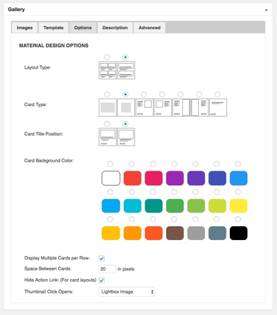
Options
Layout Type: Choose between Grid or Cards. With cards you can choose to have one card per row or allow multiple card per row. The options will changed based on the type of layout you choose.
Grid Options
Grid Tile Type: Choose between Image Only, an Image with a Single Line of text or an Image with Two lines of text.
Grid Text Position: Choices include Header Attached (above the image), Header Overlay (over the top of the iamge), Footer Attached and Footer Overlay.
Text Background Color: Sets the background color of the grid items.
Grid Text Color: Color of the text when the Text Background Color is white.
Grid Columns Options
Number of Desktop Columns: For desktop computers and laptops choose 2, 3, 4 or 6 items per row in the grid.
Number of Tablet Columns: For tablet devices choose 2, 3, 4 or 6 items per row in the grid.
Number of Mobile Columns: For mobile devices choose 2, 3 or 4 items per row.
Thumbnail Click Opens: Choose what clicking on the gird or card link or image will do:
Display the image in a lightbox
Show the image page
Open the link associated with the image
Display the original image
Or open the associated link in a lightbox
Card Type Options
Card Type: Choose Wide, Square, Image Embedded Right, Image Embedded Left, Image Attached Right, Image Attached Left or No Image.
Card Title Position: Choose between Over Image or In the Content.
Card Background Color: Sets the background color of the cards.
Card Action Color: Set the color of the action link.
Display Multiple Cards per Row: Individual cards will appear one per row unless this box is checked.
Space Between Cards: Here you can enter the amount of horizontal space, in pixels, to have between cards.
Hide Action Link: This option will hide the action link when checked.
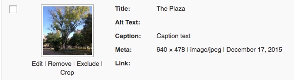
To add text to a card or grid item, go to the image tab and place the mouse over an image. This action will cause four links to appear as image below demonstrates.
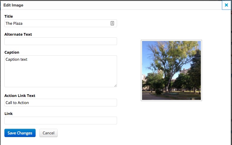
Clicking the Edit link will display the edit box where you can fill in the first and second lines of text and a link that will be associated with the image and/or action link.