Material design is a design style developed by Google that makes heavy use of design techniques like cards, grids, and lighting/shadows.
With the Material Design addon for MaxGalleria, you can easily bring those same Material Design principles to any of the galleries that you create with the free MaxGalleria plugin.
In this post, we’ll take you through how to get up and running with Material Design styling for your galleries, as well as some basic troubleshooting tips.
How To Use MaxGalleria Material Design Addon
Because Material Design is an addon for MaxGalleria, you’ll need both the Material Design addon and the free MaxGalleria plugin installed to continue.
Once you have both plugins installed and activated, here’s how to create WordPress galleries using Material Design principles.
Step 1: Create New Gallery Or Choose Existing Gallery
The Material Design addon provides a template that you can apply to any of the galleries that you create with the MaxGalleria plugin.
As a result, to start using the addon, you’ll need to either create a new gallery or edit one of your existing galleries.
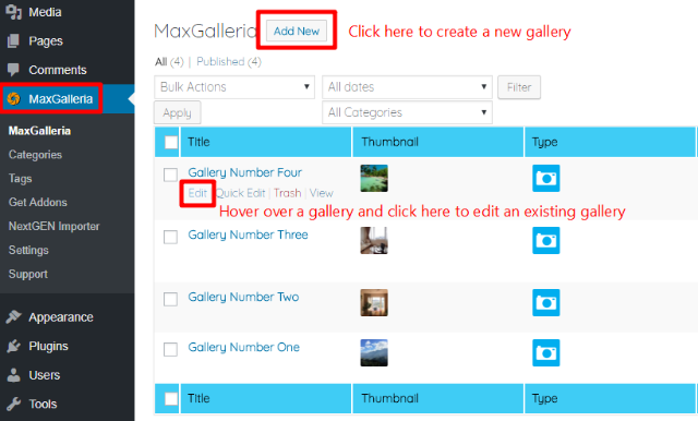
You can perform either of these actions by clicking on the main MaxGalleria link in your WordPress dashboard menu. Then, click the options to either Edit an existing gallery or Add New gallery:
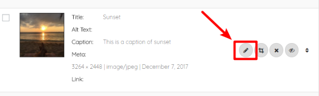
On the next page, you can use the +ADD IMAGES button to add new images to your gallery. You can also edit, crop, reorder, or remove images by using the set of buttons next to each individual image:
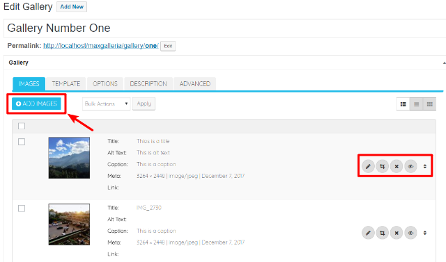
Once you’re happy with the images in your gallery, you’re ready to select the Material Design template.
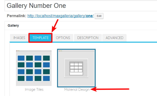
Step 2: Choose Material Design Template
To choose the Material Design template, click on the TEMPLATE tab and then select the option for Material Design:
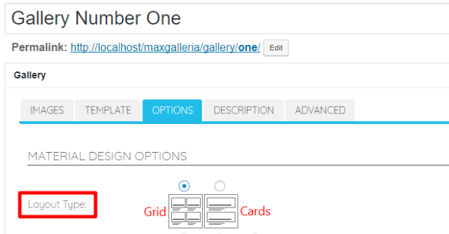
Step 3: Choose Material Design Layout Type And Configure Options
Next, click on the OPTIONS tab to configure how your Material Design gallery will look and function.
To get started, select your Layout Type to reveal the relevant options (each layout type has a different set of settings). You have two options:
- Grid
- Cards
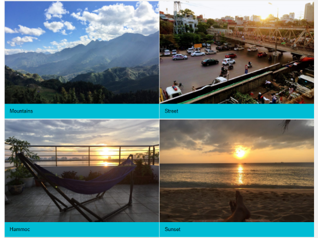
Here’s roughly what a Grid layout looks like:
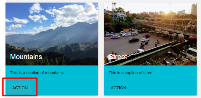
And here’s roughly what that same set of images looks like using a Cards layout:
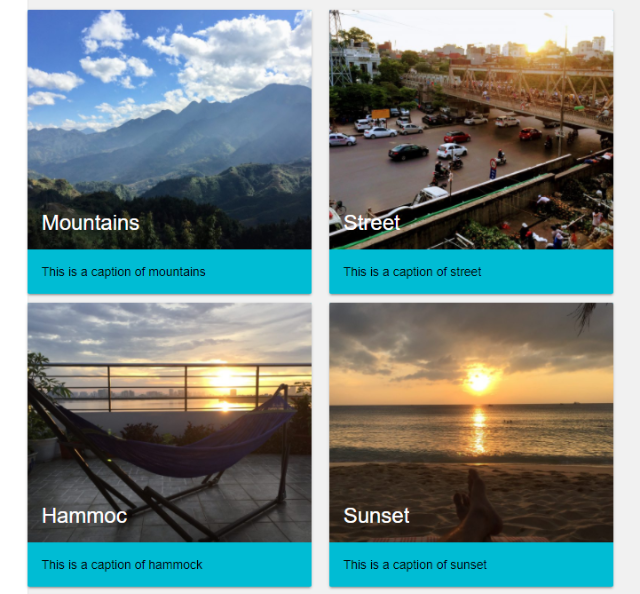
Notice how the Cards layout creates a “raised” effect?
Configuring Grid Layout Options
If you choose a Grid layout, you’ll see the following set of MATERIAL DESIGN OPTIONS (we’ll cover Cards layouts in a second):
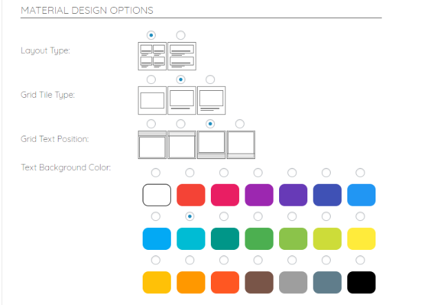
Here’s what the various options mean:
- Grid Tile Type – you can choose to display the image only or display the title and/or caption along with the image.
- Grid Text Position – if you chose to display the title and/or caption, this option lets you specify where that text should appear.
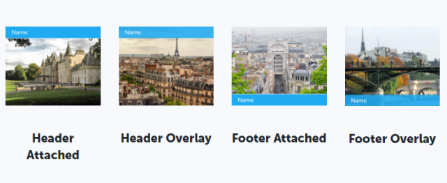
- Text Background Color – if you chose to display the title and/or caption, this lets you specify the background color for the text.
Below those options, you can configure additional settings in the GRID COLUMNS area:
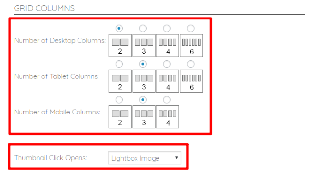
The first three options let you configure responsive design functionality by specifying the number of columns to use for different devices:
- Desktop
- Tablet
- Mobile
And the Thumbnail Click Opens option lets you choose what happens when a visitor clicks on one of the gallery images. You can choose to:
- Open a lightbox popup
- Take visitors to the image page
- Send visitors to the Image Link (you can specify this link by editing individual images in the Images tab)
- Take visitors to the original image
- Open a link in a lightbox popup
Configuring Cards Layout Options
If you select the Cards layout type, you’ll only have one set of MATERIAL DESIGN OPTIONS:
Here are what the various options mean:
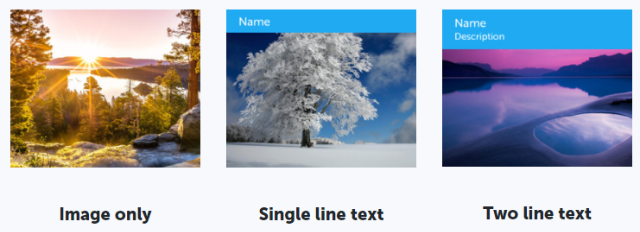
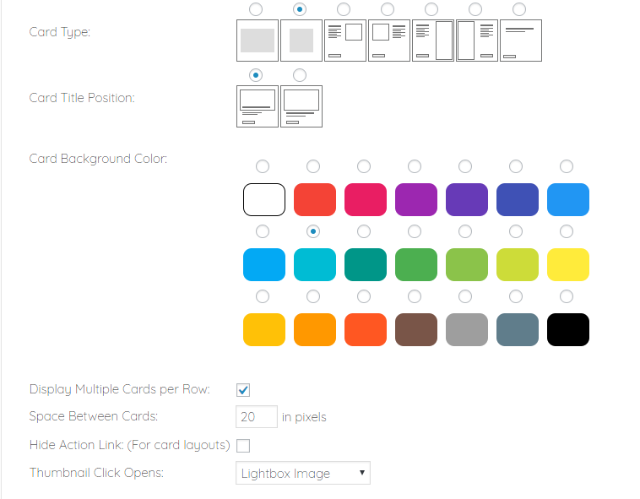
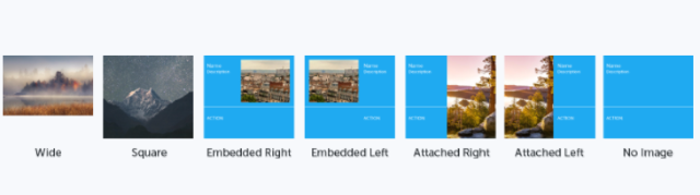
- Card Type – lets you choose how your cards look. You can either only display the image or choose various arrangements of images and text. You can even completely hide the image, if needed!
- Card Title Position – if you chose a Card Type that only includes the image, this lets you specify whether the card title appears “on” the image or below the image.
- Card Background Color – lets you choose the background color for your cards.
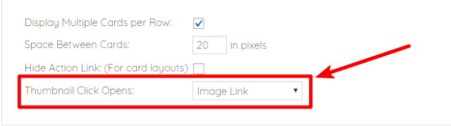
- Display Multiple Cards per Row – when checked, your gallery will display multiple cards per row (depending on your visitors’ screen resolutions). When unchecked, your gallery will only display one card per row no matter what.
- Space Between Cards – lets you specify the gap between individual cards (in pixels).
- Hide Action Link – by default, the plugin will add an Action link on your card (see image below for example). When you check this box, you remove the Action link.
- Thumbnail Click Opens – lets you choose what happens if a visitor clicks on an individual image.
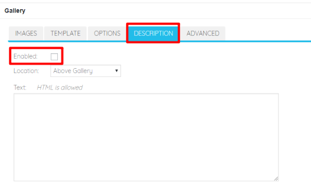
Step 4: Add Gallery Description (Optional)
After you finish configuring your Material Design gallery options, you can add an optional description above or below your gallery in the DESCRIPTION tab:
Step 5: Publish/Update And Insert Shortcode
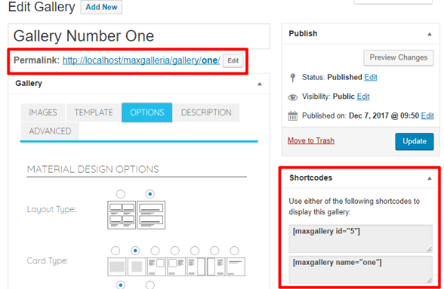
Once you’re happy with how your gallery is configured, you need to either Publish (for new galleries) or Update (for existing galleries) the gallery.
Once your gallery is published/updated, you can access it at its permanent URL or you can use the shortcode to insert it anywhere on your site (note – for new galleries, the shortcode only appears after clicking the Publish button):
Tips And Troubleshooting For MaxGalleria Material Design Addon
Below, we’ll go through some common troubleshooting tips for Material Design galleries.
How To Link To Custom URL When Visitor Clicks On Image
If you want to link to a custom internal or external URL when a visitor clicks on an individual gallery image, here’s how to do it:
- First, make sure you chose the Image Link option for Thumbnail Click Opens in the OPTIONS tab:
- Go to the IMAGES tab
- Click the pencil icon next to the image you want to edit the link for
- Enter your desired URL in the Link box
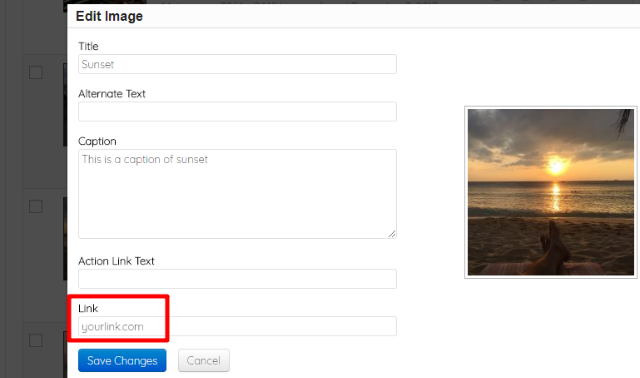
- Make sure to save your changes and update the gallery
How To Change Action Link Text
By default, the Action link for the Cards layout type uses the generic text “Action”. You can change this text on a per image basis, though.
Here’s how:
- Go to the IMAGES tab and click the pencil icon next to the image you want to change the action text for
- Enter your desired action text in the Action Link Text box
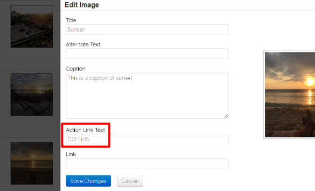
- Make sure to save your changes and update the gallery
And that wraps up our guide on how to use the MaxGalleria Material Design addon!