The Full Width addon is now included with MaxGalleria Pro and no additional installations are necessary. NB: Support for our individual addons will no longer be available from the 1st May 2022.
MaxGalleria Full Width Grid allows one to easily create beautiful grid galleries without any coding.
Before installing MaxGalleria Full Width Grid ensure that the free WordPress Gallery MaxGalleria plugin is already installed and activated as this plugin provides the backend user interface for creating galleries.
To get started, install the plugin by going to the WordPress Plugins, Add New page and click on the Upload Plugin button and select the plugin file downloaded from MaxGalleria.com. Once uploaded, activate the plugin.
After activation, go to MaxGalleria Settings and click the Grid link on the left side of the page.
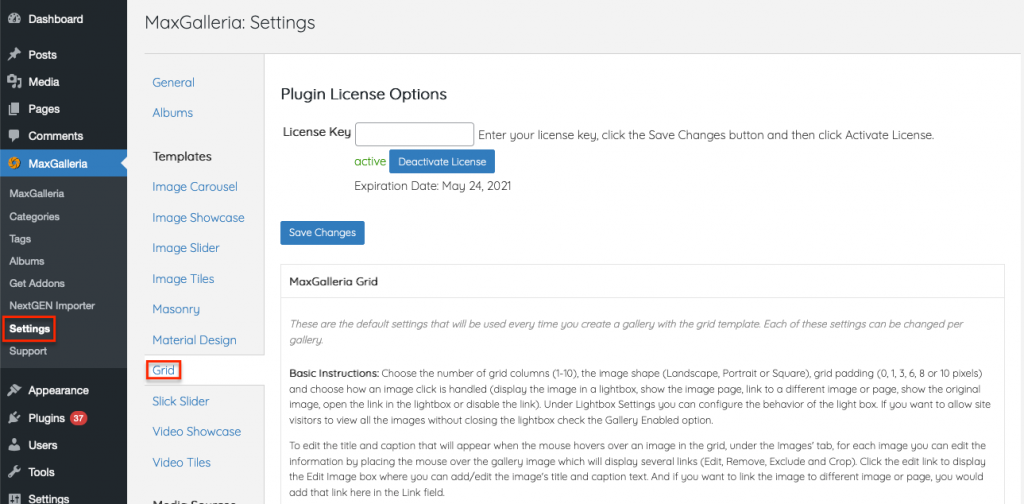
Here paste in your MaxGalleria Gird license key and click the Save Changes button.
Then click the Activate License button.
Once the page refreshes, the button should change to deactivate license.
While still on the Grid settings page, you can set the defaults grid galleries on your site. This step is optional. Each gallery allows you to set the same settings.
Grid Columns: Set the number of columns.
Minimum Thumbnail Width (optional): When using small images, it is helpful to see a minimum width.
Image Shape: choose between portrait rectangle, landscape rectangle, or square.
Grid Padding: Set the amount of padding, in pixels, between images (horizontal and vertical).
Image Click Opens: Choose what should happen when an image is clicked
Close Content on Click Enabled: Allows clicking anywhere on the page to close the lightbox
Hide Close Button: Removes the close icon from the lightbox
Lightbox Close Icon: Set the close icon to display
Lightbox Arrows: Set the arrow type to use with the lightbox
Lightbox Captions Enabled: Will display the caption text at the bottom of the lightbox
Retina Images Enabled: Enabling Retina Images requires two images both with the same path, a normal resolution image and a high-resolution image with a file name ending with ‘@2x’. Example: image.jpg & image@2x.jpg. Include the normal resolution image in a gallery and load high-resolution images directly to the WordPress Media Library. When Retina Images are enabled then the popup will display the high-resolution image on high-dpi screens.
Gallery Enabled: Displays previous and next navigation arrows with the lightbox
Navigate By Image Click Enabled: Advance to the next image by clicking on the page
Arrow Button Markup: specifies the HTML for the left and right lightbox arrows.
The default HTML for the arrows is ‘<button title=’%title%’ type=’button’ class=’mfp-arrow mfp-arrow-%dir%’></button>’ %title% is used to insert the left or right button title, see below. %dir% automatically inserts ‘right’ or ‘left’ into the HTML class.
Left Button Title: Text to display when hovering over the left arrow
Right Button Title: Text to display when hovering over the right arrow
Counter Markup: HTML to display in the image counter. The default is ‘<div class=’mfp-counter’>%curr% of %total%</div>’. %curr% is the current image number and %total% is the total number of images.
Lazy Load Enabled: Lazy Loading allows for faster page loading times and is enabled by default for a better user experience.
Lazy Load Threshold: (0 for off or 1 for on) Loads images before they scroll into view
Grid Image Custom Class: Adds a custom class to the image HTML to customize the image appearance with additional CSS code
Image Custom Rel Attribute: An optional attribute that defines the relationship between the gallery page and the linked item.
Image display order: Ascending or descending
Align Top Enabled: If set checked, the popup is aligned to top instead of to center.
Fixed Content Position: Choose between auto, on or off.
Overflow Y: Displays a vertical scroll bar on the page when Fixed Content Position is on or auto
Popup Custom Class: Adds a custom class to the lightbox
Removal Delay: Sets the number of seconds to delay removal of the lightbox
Vertical Fit Enabled: If large enough, will image will be resized to fit vertically on the page
Zoom Enabled: Zoom settings can be used with custom CSS to create special effects for displaying the lightbox; if does not enlarge an image
Zoom Easing: The type of CSS easing that is used with the zoom effect
Zoom Duration: (in milliseconds): Length of the zoom effect
Open the MaxGalleria page on your site and create a new image gallery. In the template tab, select Grid as the template to use. On the Images tab, new images can be upload and added to the gallery.
The gallery setting can be configured on the options tab. Choose the number of grid columns (1-10), the image shape (Landscape, Portrait or Square), grid padding (0, 1, 3, 6, 8 or 10 pixels) and choose how an image click is handled (display the image in a lightbox, show the image page, link to a different image or page, show the original image, open the link in the lightbox or disable the link). Under Lightbox Settings you can configure the behavior of the light box. If you want to allow site visitors to view all the images without closing the lightbox check the Gallery Enabled option.
To edit the title or caption that will appear when the mouse hovers over an image in the grid or add a link to use when the image is clicked, go to the Images’ tab. There you can edit information by using the buttons in the right column of each gallery image row.