MaxGalleria Material Design-QuickStart

INDEX

QUICKSTART GUIDE

Getting Started

The Material Design addon is now included with MaxGalleria Pro and no additional installations are necessary. NB: Support for our individual addons will no longer be available from the 1st May 2022.

Material Design provided a layout that can intelligently expand and reform.  It makes use of cards and grid layouts. The MaxGalleria Material Design addon can display images in a card layout:

or a grid layout.

You are able to specify layout type, card or grid types, title position, background color and link options.

Activating the Material Design addon will allow you to use the Material Design template in your image galleries. You will need to have the free WordPress Gallery plugin MaxGalleria installed in order to use the Material Design addon.

To set the template or layout for a gallery, open the gallery and go to the Template tab. Select the Material Design template. Then save the template as a draft or click the publish button.

The Material Design Settings and Options panels provides a visual display of the available options. If an option illustration is not clear, hold your mouse over it and it name/function will be displayed.

Options

Layout Type: Choose between Grid or Cards. With cards you can choose to have one card per row or allow multiple card per row. The options will changed based on the type of layout you choose.

Grid Options

Grid Tile Type: Choose between Image Only, an Image with a Single Line of text or an Image with Two lines of text.

Grid Text Position: Choices include Header Attached (above the image), Header Overlay (over the top of the image), Footer Attached and Footer Overlay.

Text Background Color: Sets the background color of the grid items.

Grid Text Color: Color of the text when the Text Background Color is white.

Grid Columns Options

Number of Desktop Columns: For desktop computers and laptops choose 2, 3, 4, 6 or 12 items per row in the grid.

Number of Tablet Columns: For tablet devices choose 2, 3, 4, 6 or 12 items per row in the grid.

Number of Mobile Columns: For mobile devices choose 2, 3 or 4 items per row.

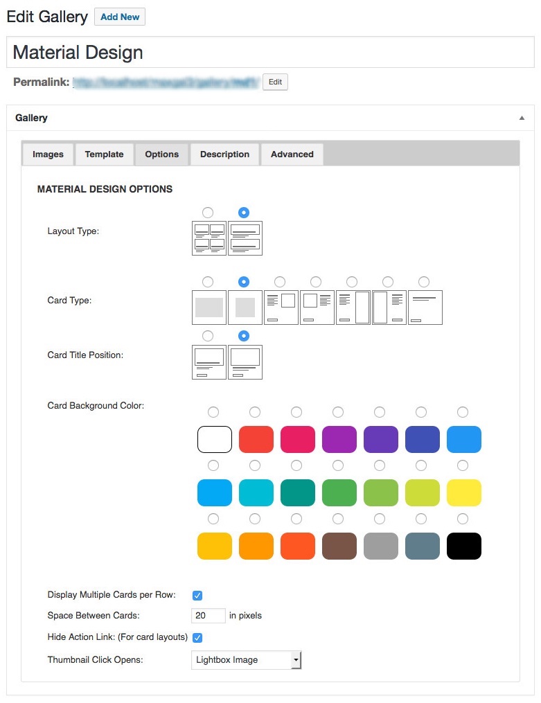
Thumbnail Click Opens: Choose what clicking on the gird or card link or image will do:

  • Display the image in a lightbox
  • Show the image page
  • Open the link associated with the image
  • Display the original image or open the associated link in a lightbox
  • Card Type Options

Card Type: Choose Wide, Square, Image Embedded Right, Image Embedded Left, Image Attached Right, Image Attached Left or No Image.

Card Title Position: Choose between Over Image or In the Content.

Card Background Color: Sets the background color of the cards.

Card Action Color: Set the color of the action link.

Display Multiple Cards per Row: Individual cards will appear one per row unless this box is checked.

Space Between Cards: Here you can enter the amount of horizontal space, in pixels, to have between cards.

Hide Action Link: This option will hide the action link when checked.

HOOKS

Filters

Actions